


Logos + Collateral Sets
Astral is a food, cocktails, and wine pop-up, with a lovely couple, John and Lauren, here in Portland! We’ve created dual logos, a wordmark, and a number of patterns and menus so far. Their love for high-end culinary experiences and a modern, less linear design taste brought us to this fun gradient of a logo - couldn’t be happier! >>> astralpdx.com
Logo, type, color brand package as an initial look for condominium sales in the Chinese market. This new Seattle high-rise needed a brand that communicated the luxury condo vibe, sold Seattle, and was neutral to potential buyers overseas. Client: Red Propeller, Real Estate Marketing Firm
Indigo Gardens is an urban farm and bridal/event floral designer in Portland! Leah Rodgers wanted a new brand that is modern, professional, colorful, and appeals to the bridal industry without losing her personality and aesthetic = WILD(flowers)!
This project included a logo, wordmark, brand colors, fonts, guidelines, and the lovely bouquet graphic made from vintage botanical lithographs. Collateral creation is ongoing with Business Cards, stickers, and an oversized vehicle magnet for now.
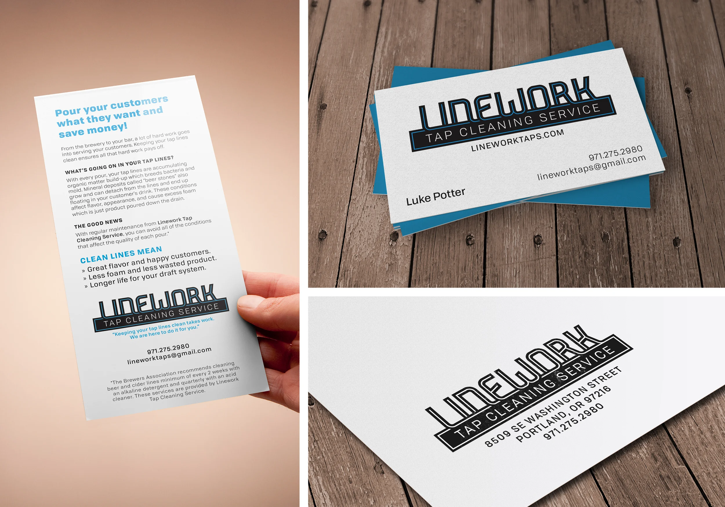
This draft beer line cleaning service, here in Portland, needed a really simple brand that felt like it fit the brewing industry, but displayed the professional vibe of the tech world. The logo is meant to mimic the connection of the lines as they are flushed of impurities and organic gunk!
This project included logo, brand colors, fonts, informative marketing flyer, business cards, and website! >>> www.lineworktaps.com
This project is a set of spaces and signage for a new YL camp on the existing Antelope Oregon larger campus. The design was a collaboration between architects designing details to attach and display signage, and the client’s specific desires. All of the WFR camps are western themed in one way or another; mining town, first western township, and western ranch style. These signs needed to meet the function of directing young teens, match similarly to other camps’ branding/signage, but keep in the theme and not over do it. Materials were chosen with the harsh weather of the Oregon desert in mind: laser cut blackened steel, etched wood, painted graphics. Client: Ankrom Moisan Architects
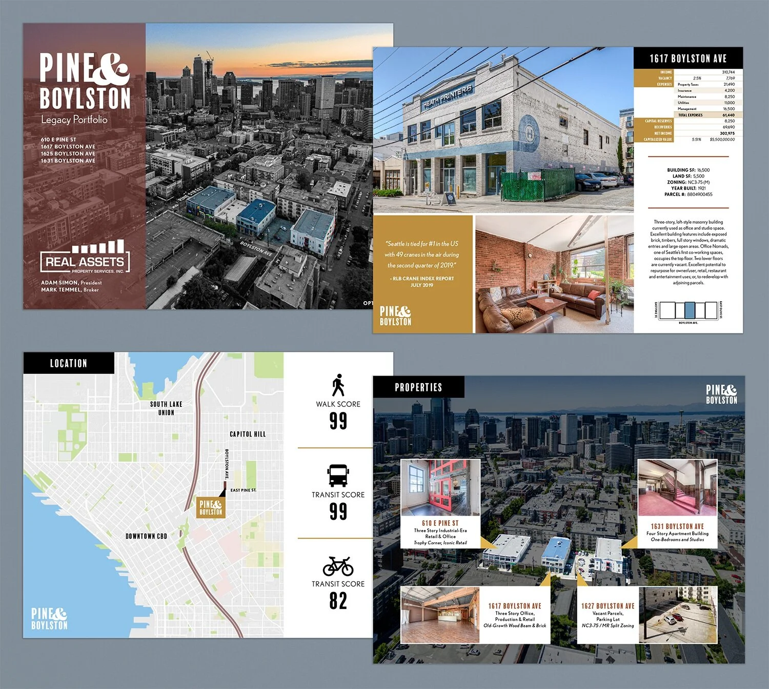
This commissioned logo, brand, and marketing package was created for a group of separate properties in Seattle to create a one cohesive sales tool for the real estate firm. We used a color palette and typeface inspired by the buildings’ historic charm, paired with the modern approach of clean communication design.
Smallwares is a casual fine dining restaurant in Portland that rejoined the land of the living in July of 2018! Johanna Ware had commissioned her logo years earlier, and needed a new look that supported her very simple and neon sign inspired brand. The idea was to stay easy to read, modern, and be easily editable/produced by restaurant staff in-house, as the menu can change daily. Thanks, Jo and Dave! >>> www.smallwarespdx.com
EP is an internal sub-brand designed for GGLO Architects, HQ Seattle. With the existing GGLO brand in mind, simplicity of application in any documents created by marketing or employees was essential, along with the ability to change the year and color for the future. Client: GGLO Architects
This project consisted of a mock branding for an architectural and interior design proposal for the renovation of the Sun River Lodge. The brand inspiration for Basin & Range was inspired by the idea that, to beer drinkers, it might as well be another element on the periodic table, while also conveying the aesthetic of the high-desert forest feel of the Sun River surroundings. Other variations on right.
WhiteBox was a production company for an online video “magazine” focused on extreme whitewater sports. This commissioned logo was meant to be used for merchandise and web only.
Company wordmark created and typeface chosen for Kathryn’s Business cards at her massage practice in NW Portland. We used the luxe options at Moo to create a raised spot gloss pattern over the top. The effect was incredibly difficult to photograph at the quality desired - apologies.
These cards were made for a start up selling boutique haircare tools. Katie wanted something original to set her apart for the crowd. These business cards were diecut from metallic cardstcok and designed to fit in any wallet or cardholder.
A pipedream brewery endeavor meant to be located in Portland’s East County and to highlight the heritage of what lies east of 82nd Ave. Logo sketches and variations.